Many South African small business owners struggle to turn website visitors into loyal customers. The reason often lies in skipping the basics of effective website design, from mobile-first layouts to clear navigation that supports local SEO. When your site prioritises user needs, loads quickly, and remains consistent across all devices, it builds customer trust and unlocks real business growth. This guide explains how the most important web design principles can help your business stand out locally and convert browsers into buyers.
Table of Contents
- Defining Website Design Best Practices
- Mobile-First Layouts and Responsive Design
- Speed, Stability, and Core Web Vitals
- SEO-Friendly Structure for Local Visibility
- Conversion-Focused Content and User Trust
- Common Pitfalls in Modern Web Design
Key Takeaways
| Point | Details |
|---|---|
| User Experience Matters | A smooth and intuitive website experience leads to higher conversion rates and customer satisfaction. |
| Mobile-First Approach | Prioritising mobile design ensures your site caters to the majority of South African users who browse on smartphones. |
| Trust and Security | Clear communication about data handling and visible security features are vital for building customer trust. |
| SEO Structure is Crucial | An SEO-friendly website structure enhances local visibility and helps customers find your services easily. |
Defining Website Design Best Practices
Website design best practices extend far beyond making your site look attractive. They form the foundation that connects your business goals with what your customers actually need when they visit your site. For South African small business owners, understanding these practices means the difference between a website that sits idle and one that actively drives leads and sales.
At their core, best practices focus on three essential areas. First, user experience determines whether visitors stay on your site or leave within seconds. This means your website must be intuitive to navigate, load quickly, and work smoothly on mobile devices (where most South African users browse). Second, security and trust cannot be overlooked. Customers need to feel confident entering their information on your site, which requires secure connections and clear communication about how you handle their data. Third, accessibility ensures your site welcomes everyone, including people with vision impairments or other disabilities who may use assistive technologies. Starting with real user needs rather than assumptions about what looks good is where successful websites begin.
These principles work together in practice. Consider a Johannesburg-based retail business that redesigned their site with these practices in mind. They simplified their menu structure, ensured every page loaded in under two seconds, and made sure customers could complete a purchase from their phone without frustration. The result wasn’t just a prettier website; it was one that converted browsers into buyers. When you prioritise user needs over flashy features, consistency across all your digital properties, and policies that maintain accessibility and security, you create a website that works as hard as you do.
Pro tip: Before redesigning or building your site, spend time actually watching how real customers try to find information or make a purchase on your current website. Their struggles reveal your biggest opportunities for improvement.
Here’s how the three key pillars of modern website design benefit South African small businesses:
| Pillar | Description | Business Impact |
|---|---|---|
| User Experience | Smooth navigation and fast loading | Higher conversion rates |
| Security & Trust | Secure data handling and SSL encryption | Builds customer confidence |
| Accessibility | Designs for all abilities and devices | Expands potential user base |
Mobile-First Layouts and Responsive Design
Mobile-first design is no longer optional for South African businesses. Over 75% of internet users in South Africa access websites exclusively through their smartphones, which means your site needs to work beautifully on small screens before anything else. A mobile-first layout starts by designing for the smallest screens first, then progressively enhances the experience for tablets and desktops. This approach flips the traditional web design process on its head, but it forces you to prioritise what actually matters to your customers.
Responsive design makes this possible by using flexible grids and layouts that automatically adjust to fit any screen size. Rather than creating separate versions of your website for different devices, responsive design uses CSS techniques like Flexbox and Grid to reflow content intelligently. When a customer views your site on their phone, the layout stacks vertically. When they open it on a laptop, the same code displays content side-by-side. Adopting responsive design and mobile-first principles ensures your site works smoothly across all devices without requiring you to maintain multiple versions. This saves time, reduces errors, and keeps your site consistent across every platform.
For a growing Cape Town e-commerce business, switching to mobile-first design meant more than just repositioning elements. They streamlined their checkout process from five steps to three, made their product images swipeable rather than clickable, and ensured buttons were sized for thumbs, not mouse cursors. Their mobile conversion rate jumped 43% within two months. Responsive layouts enhance visual appeal and usability, creating better engagement across all user groups. When designing for mobile first, focus on touch-friendly interfaces, faster load times (mobile connections are slower), and clear hierarchy that guides users toward action without overwhelming them.

Pro tip: Test your website on actual phones and tablets, not just browser developer tools, because real-world conditions like slower networks and smaller hands reveal problems that simulations miss.
Speed, Stability, and Core Web Vitals
Your website’s performance directly affects whether customers stay or leave. When a page takes more than three seconds to load, roughly half your visitors abandon it without waiting. For South African businesses competing online, speed is not a luxury—it is a competitive necessity. Core Web Vitals are Google’s specific measurements of what makes a website feel fast and reliable. These metrics determine how your site ranks in search results, which means optimising them directly impacts your visibility to potential customers.
Speed is about page load time, but it is more nuanced than a single number. A visitor on a slower mobile connection needs your site to load intelligently, prioritising the most important content first. Stability refers to how much your layout shifts around while users interact with it. Imagine clicking a button and suddenly the page jumps, moving your target. This is called cumulative layout shift, and it frustrates users immediately. Responsiveness measures how quickly your site responds when someone clicks, taps, or types. Optimising for Core Web Vitals requires reducing layout shifts and maintaining responsive interactivity, which together create the perception of speed even when absolute load times vary. A Durban-based service business reduced their layout shift by removing auto-playing videos and fixing image dimensions, instantly improving how stable their site felt. Their bounce rate dropped by 28% in the first month.
Implementing these improvements starts with practical steps. Compress your images so they load faster without losing clarity. Minify your code by removing unnecessary characters. Use a content delivery network to serve files from servers closer to your customers. Reducing server response times and adhering to Core Web Vitals benchmarks improves both user experience and search rankings simultaneously. The best part is that many of these optimisations compound—each improvement makes your next one more effective. When customers experience a fast, stable website, they spend more time exploring, which gives you more chances to convert them into paying clients.
Pro tip: Use Google PageSpeed Insights to measure your current Core Web Vitals, then focus on whichever metric scores lowest first, as fixing the worst performer typically yields the quickest improvements.
SEO-Friendly Structure for Local Visibility
When a potential customer in Johannesburg searches for “plumber near me,” Google needs to understand that your website is relevant to their location and their need. An SEO-friendly website structure makes this understanding possible by organising your content in ways that search engines can easily read and categorise. The structure of your site is like the skeleton of your business—it holds everything together and determines how well visitors and search engines can navigate your content. Without proper structure, even excellent content gets buried where no one finds it.
Start with clear navigation that reflects how your customers think about your business. If you run a beauty salon in Pretoria, your menu should guide visitors to services, pricing, booking, and your location. Each of these sections needs a logical hierarchy with a main category and subcategories beneath it. Use descriptive page titles and headings that include the services and locations you serve. When someone searches for “hair salon in Pretoria,” you want Google to instantly recognise that your page addresses exactly that query. SEO-friendly structures prioritise clear navigation and semantic HTML to improve local visibility, meaning search engines understand what each page is about without confusion. Add alt text to images describing what they show—this helps both visually impaired users and search engines understand your content.
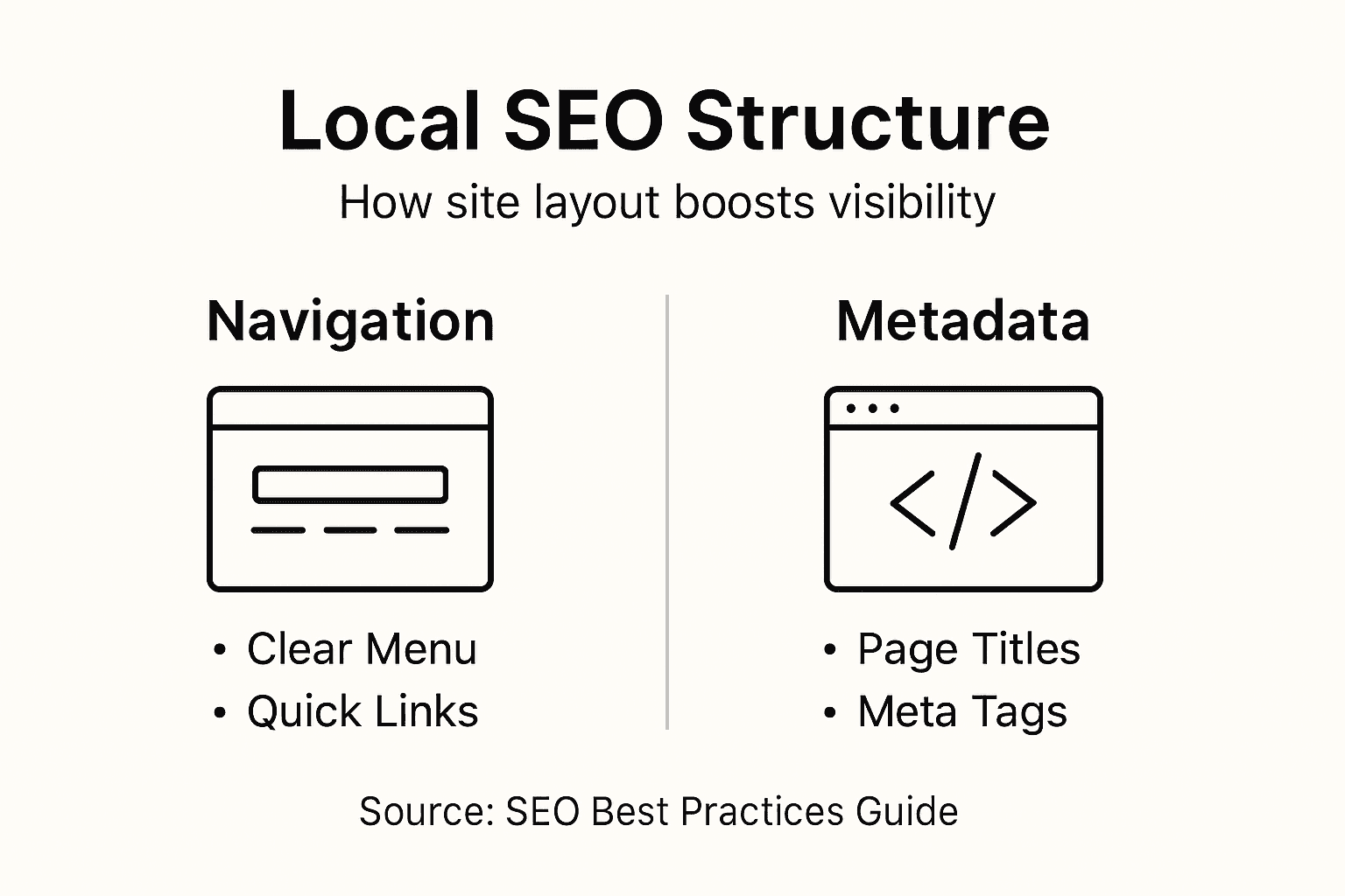
Metadata is the hidden information that tells search engines what your page is about. Your page title should be 50-60 characters and include your location and service. Your meta description, which appears below your title in search results, should be compelling enough to make someone click, whilst clearly stating your value. For a Cape Town marketing agency, a strong meta description might read: “Award-winning digital marketing agency in Cape Town. SEO, PPC, and content strategies that drive local growth.” Organising content with user-friendly navigation and appropriate metadata boosts visibility in geographic search results. When your site structure makes it easy for search engines to index your pages and understand your location focus, you naturally rank higher in local searches where your customers are actively looking.
Pro tip: Create a visual sitemap showing how your pages relate to each other, then ensure no important page is more than three clicks away from your homepage, as search engines prioritise pages that are easier to reach.
Conversion-Focused Content and User Trust
A beautiful website means nothing if visitors don’t trust it enough to take action. Trust is the invisible force that transforms a casual browser into a paying customer. When someone lands on your site, they make snap judgments within milliseconds. Does this business look legitimate? Will my payment information be safe? Can I actually get what I need here? Conversion-focused content directly addresses these concerns by speaking to what your customers actually need whilst simultaneously building confidence in your ability to deliver it. For South African small businesses, trust is often the deciding factor between losing a sale to a competitor and closing a deal.
Building trust starts with transparency and clarity. Your homepage should immediately communicate what you offer and who you serve, without forcing visitors to hunt for answers. A plumbing business shouldn’t make someone guess whether they handle emergency calls or only scheduled appointments. Include your contact information prominently, display your business hours clearly, and if you have certifications or awards, show them. Trustworthy design cues include clear calls to action and accessible information that resonates with target audiences. Customer testimonials and reviews act as social proof that real people have used your service and were satisfied. A Cape Town consulting firm increased their contact form submissions by 34% simply by adding five client testimonials with photos to their homepage. Real faces and real results are far more convincing than marketing claims alone.
Conversion-focused content guides visitors toward taking action without manipulation. Instead of vague promises, be specific about what customers receive. Rather than “affordable pricing,” say “packages starting from R499 per month.” Instead of “quality service,” explain exactly what makes your approach different. Your calls to action should be obvious and benefit-focused. “Get a free quote” converts better than “Contact us” because visitors immediately understand what happens next. Privacy assurances and straightforward service delivery establish trust, particularly when customers understand how you handle their information. Include a simple privacy statement explaining what data you collect and why. Make your refund or satisfaction guarantee visible. When customers know the risks are minimal, they feel safer making a purchase decision.
Pro tip: Add a single testimonial with a specific result above the fold on your homepage (for example, “Increased sales by 156% in three months”), as this single element often has the highest impact on initial trust and conversion rates.
Common Pitfalls in Modern Web Design
Many South African business owners make the same mistakes when building their websites, often without realising the damage until their bounce rates spike and leads dry up. These mistakes aren’t usually the result of negligence—they come from misunderstanding what actually works online or trying to save money in the wrong places. The good news is that knowing what not to do is half the battle. Cluttered pages top the list of design disasters. When you try to cram too much information, too many images, and too many calls to action onto a single page, visitors become overwhelmed and leave. A Durban retailer once filled their homepage with 47 different product categories, banners, and animations. Their conversion rate was nearly zero. After simplifying to show just five featured categories and a clear search bar, conversions jumped 89%. Less truly is more when it comes to web design.
Another critical pitfall is ignoring mobile optimisation in 2024, which is frankly inexcusable. Yet businesses still launch websites that look beautiful on desktop but become unusable on phones. Buttons become too small to tap, text becomes impossible to read, images take forever to load, and checkout processes require endless scrolling. Common design pitfalls include poor responsive design, lack of mobile optimisation, and ignoring accessibility standards. These mistakes directly reduce your site’s effectiveness and frustrate the majority of your visitors who are browsing on mobile devices. Poor navigation confuses visitors about where they are and where to go next. If someone can’t easily find what they’re looking for within three clicks, they’ll search your competitor’s site instead. Inconsistent navigation across pages, missing breadcrumbs, and unclear menu labels all contribute to this problem.
Accessibility is often overlooked but absolutely critical. If your images lack alt text, colour contrast is too low, or your site doesn’t work with screen readers, you’re shutting out customers with vision impairments and potentially violating accessibility laws. Neglecting user research, overlooking security, and ignoring consistent navigation creates sites that don’t serve real user needs. Before redesigning your site, actually talk to your customers. Ask them what they’re looking for, what confuses them, and what would make them more likely to buy. This research costs very little but prevents expensive mistakes. Security matters too. If your site isn’t encrypted with SSL (look for the padlock icon), visitors will see a warning message, killing any chance of conversion. Ignoring these fundamentals might save a few thousand rands in the short term, but it costs you far more in lost business.
Pro tip: Audit your current website by spending 15 minutes trying to complete your primary business goal (making a purchase, booking a service, requesting a quote) on both mobile and desktop, noting every frustration point you encounter.
Compare the main causes and typical results of common web design pitfalls:
| Pitfall | Frequent Cause | Likely Outcome |
|---|---|---|
| Cluttered Pages | Overloading content and visuals | Visitor overwhelm, low sales |
| Poor Mobile Optimisation | Desktop-focused design choices | Frustrated mobile users, lost leads |
| Ignored Accessibility | No alt text or poor contrast | Excludes users with disabilities |
| Weak Security | No SSL or privacy disclosures | Reduced trust, higher bounce rate |
Elevate Your South African Brand with Trusted Website Design and SEO Solutions
Navigating the complex world of website design best practices can feel overwhelming when you are trying to grow your South African business. From prioritising mobile-first layouts and enhancing Core Web Vitals to building SEO-friendly structures that boost local visibility, every detail affects your ability to convert visitors into loyal customers. If you are struggling with slow site speed, poor mobile optimisation, or weak user trust, these challenges hold back your online potential and limit lead generation.
Don’t let common pitfalls like cluttered pages or ignored accessibility standards damage your online reputation. Partner with a team that understands these pain points and specialises in creating websites optimised for user experience, security, and conversion-focused content. At Local SEO Agency we offer customised digital marketing and website design services crafted to drive real results. Whether you need to improve your local SEO optimisation, enhance site performance, or build trust through strategic content, we have the solutions to help your brand stand out in South Africa’s competitive digital landscape. Start improving your online presence today by contacting us through our contact page for a personalised consultation and take the first step to a faster, more effective website.
Frequently Asked Questions
What are the key principles of effective website design?
The key principles of effective website design include user experience, security and trust, and accessibility. These factors ensure that the website is easy to navigate, secure for users, and welcoming to all audiences.
How can I improve my website’s mobile responsiveness?
To improve mobile responsiveness, adopt a mobile-first design approach, use responsive design techniques such as flexible grids, and optimize touch-friendly interfaces, ensuring that your website looks and functions well on all devices.
What are Core Web Vitals, and why are they important for my website?
Core Web Vitals are specific metrics defined by Google that measure page load speed, layout stability, and responsiveness. They are important because they directly impact user experience and can influence your website’s ranking in search results.
How can I build trust with my website visitors?
You can build trust with your website visitors by being transparent about your services and pricing, showcasing customer testimonials, and ensuring secure payment processing. Clearly displayed contact information and privacy policies also foster trust.
Recommended
- Top Small Business Website Tips for Better Online Results
- Winning South African SEO Techniques to Elevate Your Brand – LSA SEO Agency
- Transform Your Website Using South African SEO Techniques – LSA SEO Agency
- How an SEO Consultant South Africa Can Transform Your Brand – LSA SEO Agency
source https://localseoagency.co.za/website-design-best-practices-sa/

No comments:
Post a Comment